Anyways, I have a bit of an understanding in shading, in my horses at least. I've been doing very simple backgrounds, with not much detail.. and I feel like I am being starved!!!!! I have these images in my head, and it's just a nightmare working a background out of it. *sigh* So, on my trade I am working on, I stopped working on the horse, and went directly to the background.. I have to focus on it, and try to learn how to use color gradiants and dynamic brushes to acheive somewhat what I am hoping for. Photoshop was a learning curve for me, and I still struggle with being overwhelmed, but its all one layer at a time :)
here's what I been working on, any insight will be awesomeeees
Just started the working the clouds now, I just learned that if I click on the "dynamics" or "scattering" I can further define the brush I am using. Aah! So excited,
I placed up screens shots and quick blurb about what I was doing, I hope with doing such, a few comments or tips on what to try next time will help me immensely.
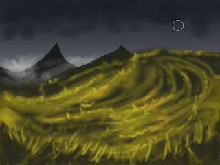
I was getting frustrated with the brushes, but now I have it sorted, I just started making myself some custom dynamic cloud brushes. Theses clouds in the picture below are just started, still alot of work to do , but it should be pretty cool if they work out in the end.
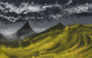
Here I started combing the hill with grass brushes, I wanted to get it set up with a "flow" of how the grass is running along.
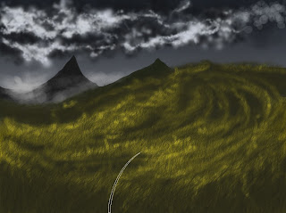
After that, I played around with levels and curves, and brightness to get depth in the grass, I almost ended there, but the left side was hideous!! I dunno, looked REALLY terrible!
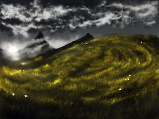
I decied to balance it by adding a tree. I never drew a tree before in PS, so it was a lot of trial and
error. I found for myself, Id rather have the leaves scatter with some jitter, and kind of thicken
the tree up that way. I also adjusted the color of the sky, cause the grey/blue was starting to
bother me.
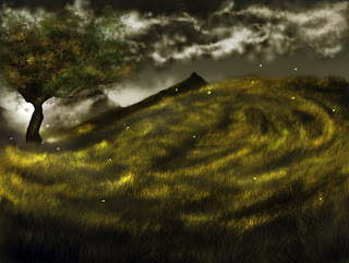
Finally, I darkened up certain areas, in the clouds, cause they were akward.. they still are akward, im still working on learning how to make them pretty. I also, went around the image
and lightened and darkened, just to add depth and work with the light, like the shadow in front of the tree. I still think this is blah, but it's all about learning from my mistakes.
I'm happy with it though! It's a step in the right direction :)
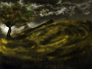
***[Disclaimer Stuffs] Steal this image, and I will personally stab your eyes out with my wacom pen... yes, the one I used to create this picture.
No comments:
Post a Comment